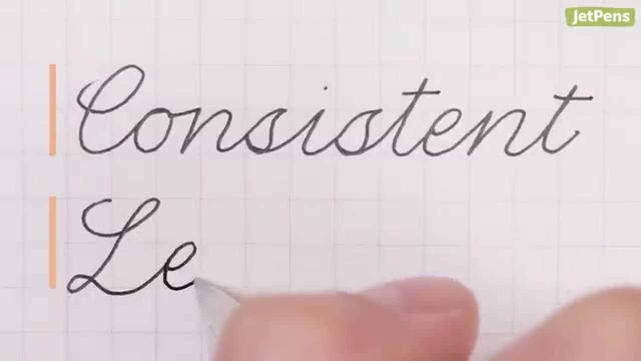
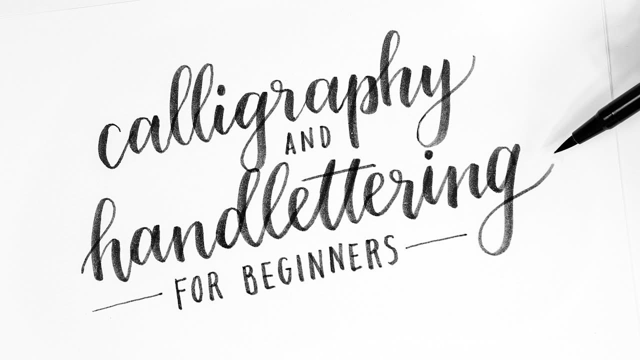
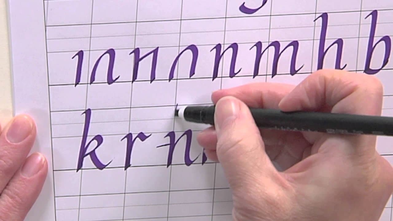
A lot of schools don't teach cursive anymore. If you grew up after the changeover and want to fill the gap, the technique itself is straightforward - the slow part is the practice that builds muscle memory. JetPens walks the whole sequence in the video.
Cursive is not calligraphy. Calligraphy is drawn with a nib that thickens under pressure; cursive is handwriting that connects. For that look, start with calligraphy instead.
What you need
- A gel pen or fine liner, fine or medium point
- Lined or grid paper - the guideline keeps your heights honest
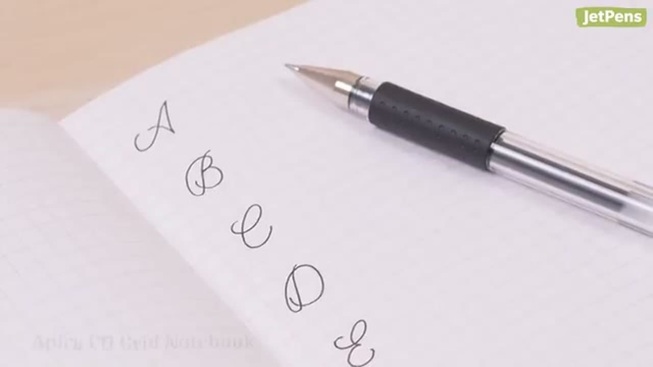
- A printed cursive alphabet to copy from
- Twenty minutes of cursive writing a day, more days than not
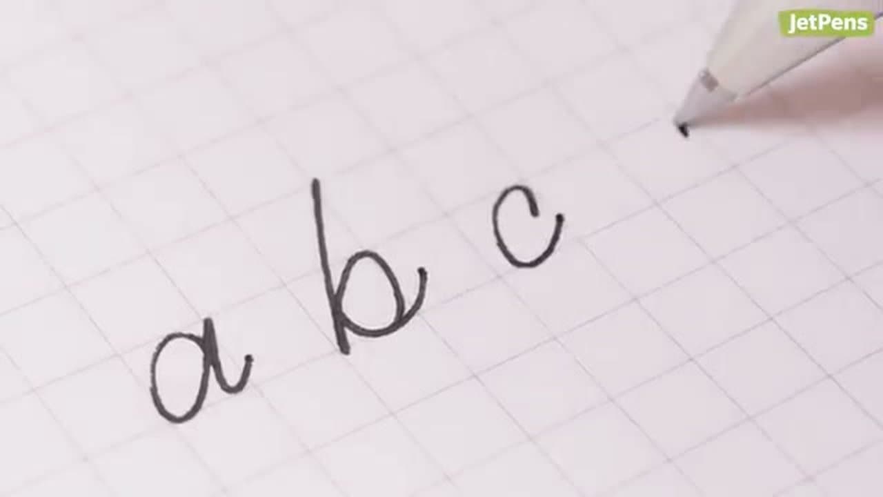
The cursive alphabet, letter by letter
A to Z in order is the slow way round. The lowercase letters fall into families that share a stroke, and the stroke hands you the family.
- Undercurve: a, d, g, q, c, o. All scoop up and over into a round body. Get a clean and d, g and q are that shape with a new tail.
- Overcurve: m, n, v, x, y, z. These arch over the top. Drill n until the humps match; m is one more hump.
- Loops: b, f, h, k, l, e. Up, back down the same track, into the body. Keep it narrow; wide loops turn a page into a tangle.
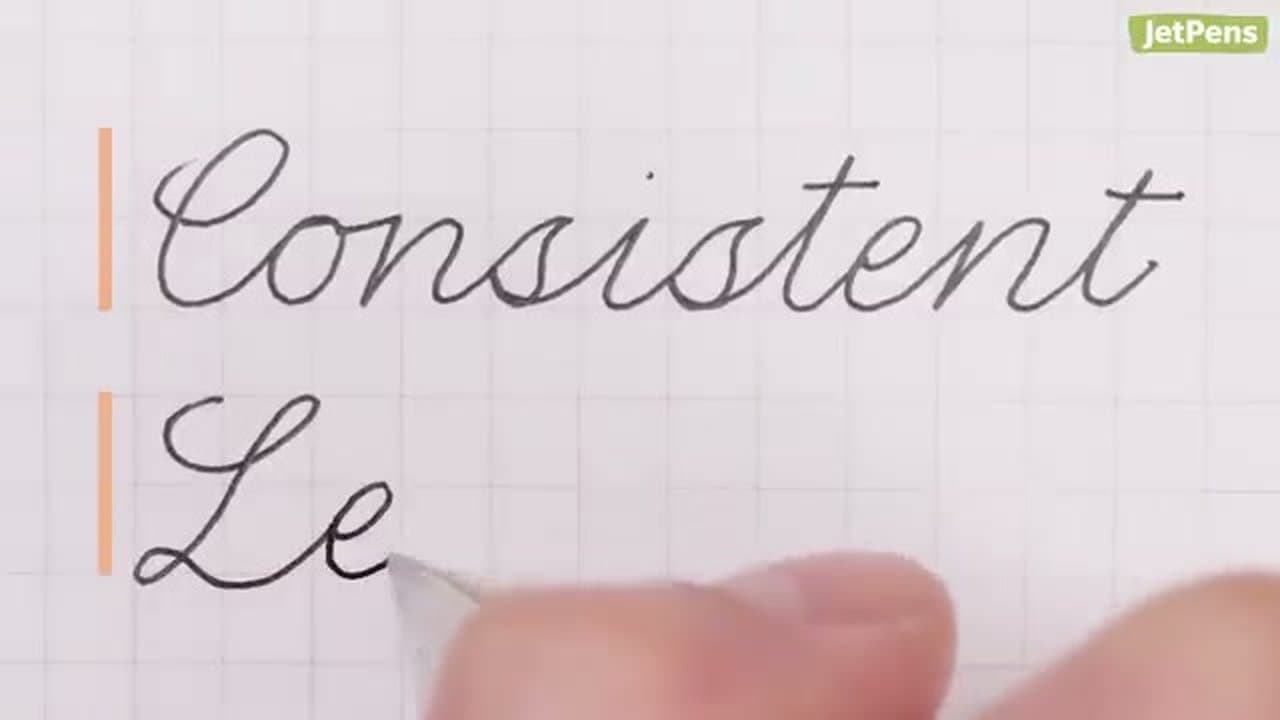
Capitals are a separate job. Learn the ones in your name and address. For those shapes with fewer joins, italic hand shares the skeleton.
The letters people get stuck on
These get searched by name far more than the rest, because they look nothing like print.
- j is the most asked-about letter in cursive by a distance. Small undercurve body, tail below the baseline looping back left, dot last. A straight print-style descender is the usual mistake.
- Capital G reads closer to a printed S with a bar than to any G, and capital Q is a large numeral 2 in most looped styles.
- r has a shoulder and flat top that collapses into an i once you speed up.
- s points at the top and closes with a small loop at bottom left.
- z drops a tail below the baseline, not the flat printed shape.
- f is the only lowercase letter looping above and below the line at once, so it takes the most practice.
Joining the letters
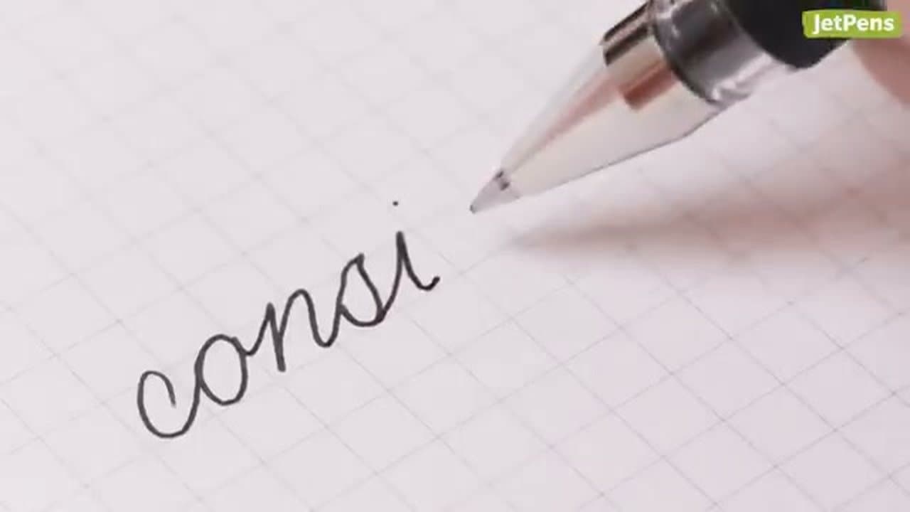
The joins are where a beginner's page comes apart. Almost every lowercase letter exits at the baseline. Four do not: o, v, w and b finish high, so the join drops into the next letter instead of rising into it, and it looks stretched until your hand adjusts.
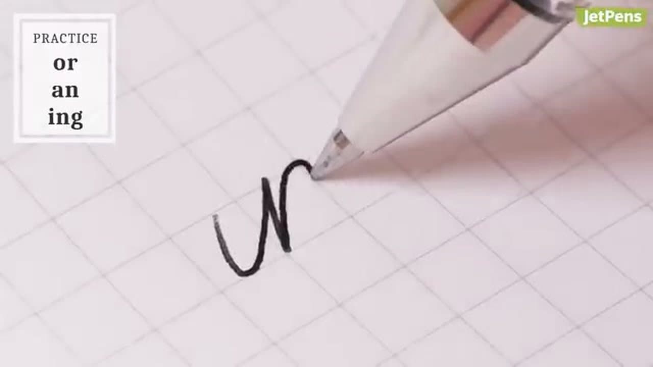
Drill the awkward pairs before words - or, ov, wa, br, oo - then the pairs in nearly every sentence: th, in, ing, ed, an.
Slant, spacing and what goes wrong
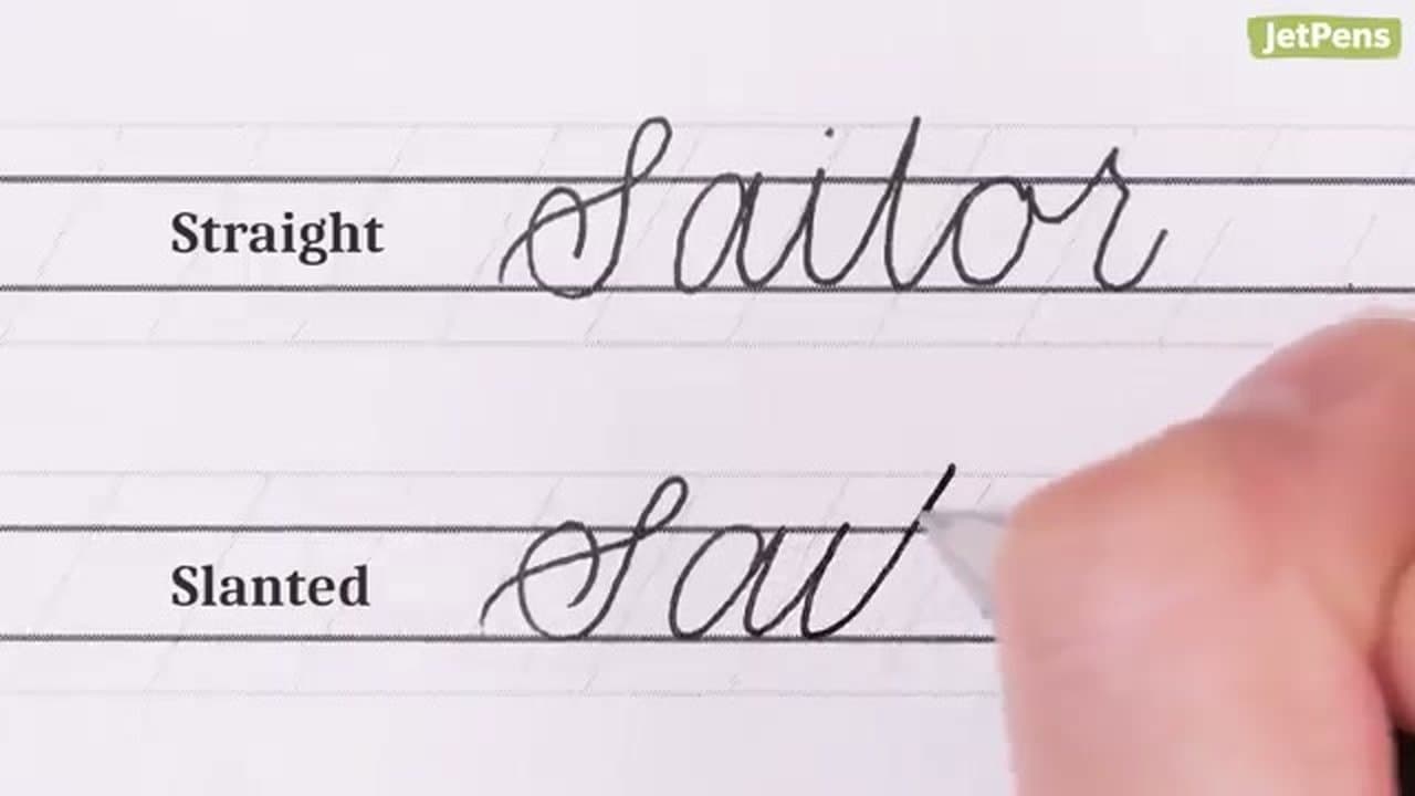
Slant drifts. A paper angle problem, not a hand problem. Tilt the sheet 30 to 45 degrees, top left for right-handers and top right for left-handers, and move from the forearm.
Size and spacing wander. Lined paper fixes this faster than concentration. Bodies touch the midline, tall letters the top line, g and y hang the same below, and words stay about one lowercase o apart.
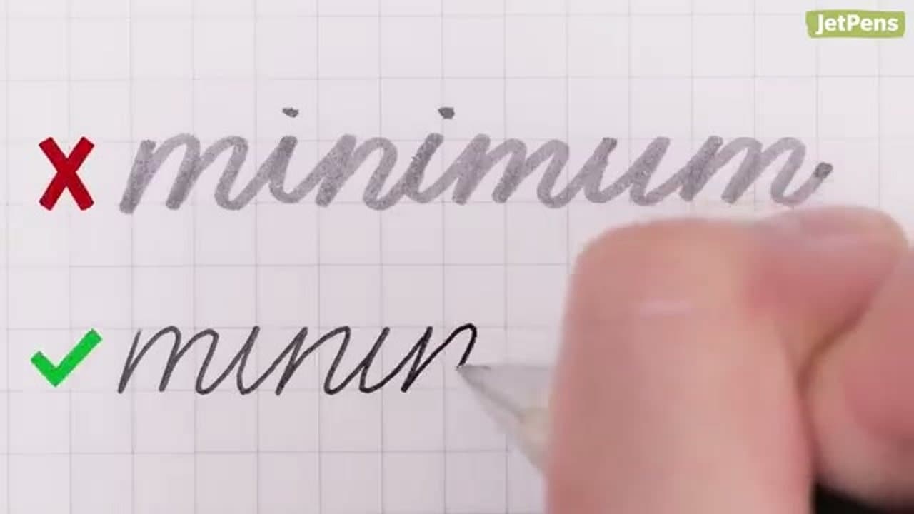
Your hand cramps. You are gripping too hard, usually because the pen needs pressure to write at all. A gel pen glides; a tired ballpoint does not.
Letters fine, connections ugly. Cut to half speed on the join. Rushing a transition between shapes you know is the common cause.
One page a day beats an hour on Sunday, and a month of that is the honest timeline for an adult starting cold. For a flourished card without a special pen, faux calligraphy thickens the downstrokes afterwards; the beginner's calligraphy path picks up where neat handwriting stops.